The myWPI platform is accessible to all users by default; however, the individual content items uploaded by faculty and students may not be. How can the common documents we use day to day be made accessible for users with visual impairments or learning and cognitive disabilities?
You’ll be happy to hear that there are just a few simple changes you can make to your documents that can make a big difference. Documents that can be made accessible include: Microsoft Office documents, PDFs, HTML pages and multimedia recordings.
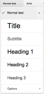
This post will talk exclusively about one of these changes: Semantic structure in Microsoft Office documents. (Note: Google Docs also has similar offerings). Semantic structure makes your document easier to be read by visually impaired students who use screen readers.
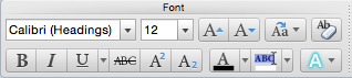
Typically, we tend to favor the “Font” section of our word processor’s styling section. Font includes font size, bold, italics, underline, etc. However, these cannot be interpreted by assistive technologies like screen readers, so our visually impaired users cannot grasp the same visual structure of a document that sighted users can.
Creating a semantic structure using the “Styles” section in Microsoft Office instead of the “Font” section is just as easy, and will allow visually impaired users to distinguish between normal paragraphs, headings, and otherwise emphasized text.
For example, when a visually impaired user is using a screen reader, the auditory feedback when approaching a page heading (example: using the heading from this document) using the “Styles” section will read “Heading 1: myWPI Accessibility Series: Providing Semantic Structure to your Documents.” If I had just made the font size of my heading larger, it would not have a “Heading 1” tag. A visually impaired person would not know the difference between the title and the body content of the paper.
Every document should have one “Heading 1” as your document’s title. There should be only one per document. Use “Heading 2” for your main section titles in your document and “Heading 3” for your subsection titles. If you need more granular subsections, heading 4-6 are also available. Feel free to customize the color and font of these styles by clicking the icon for “Change Quick Styles Settings” under the Styles header in the ribbon menu.
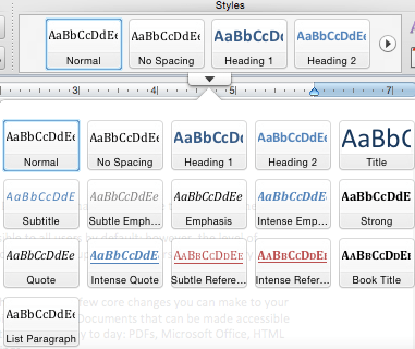
Instead of using Bold and Italics from the “Font” section, use the “Styles” menu for this as well. You may use “Strong” in place of Bold, and “Emphasis” in place of Italics. If you are converting an old document, simply highlight the text you would like to change, then click on the style and it will convert your text to an accessible style.
Use the Table of Contents feature after creating or modifying your document using “Styles”, it will be automatically be created using your Headings and create hyperlinks to make it easier to navigate.
WPI’s Office of Disability Services provides advocacy and support for students with disabilities. Visit their website for more information.
Stay tuned for more tips on making your myWPI course site accessible to all!
Source: http://www.3playmedia.com/how-it-works/webinars/online-courses-10-08-2015/