

Evaluating Interactives at the Postal Museum and Mail Rail
| Sponsor: | The Postal Museum |  |
| Sponsor Liaison: |
Emma Harper, Exhibitions Officer Andy Richmond, Head of Exhibitions, Access, and Learning |
|
| Student Team: |
Cole Flegel, Ziheng (Leo) Li, Thomas Perry, Huaxin Yang
|
|
| Abstract: | The goal of this research project was to evaluate interactive exhibits at the Postal Museum and Mail Rail and suggest improvement strategies to the Museum through four objectives: identifying current and best practices, soliciting Postal Museum staff’s knowledge of the exhibits, assessing visitor experiences with the interactive exhibits, and conducting in-depth evaluations of selected exhibits. In terms of deliverables, the team compiled the ratings of each exhibit in four main categories: attraction, placement, engagement, and learning. The team also presented a set of long and short-term recommendations for existing exhibits, new interactive ideas, and the museum as a whole. | |
| Link: | TPM – Final Report TPM – Report Presentation |
|
Executive Summary
The Project
The team’s goal in this project was to evaluate the interactive exhibits at the Postal Museum in London. Since the Postal Museum only opened at their new location on July 28, 2017, less than a year before the project began, and because the staff was still busy with finishing off the tasks that came with a change in location, the museum had not performed any thorough evaluation on the interactive exhibits. Such an evaluation is needed for the Postal Museum in order to determine the extent to which the interactive exhibits fulfilled their intended purpose: to attract visitors of all types and showcase stories and collections in an engaging, interactive, educational, accessible and fun way. To fulfill the goal of evaluating the interactives and providing helpful recommendations, the team established four objectives:
1. Determine the current and best practices involving interactive exhibits among other museums.
2. Solicit the knowledge of staff at the Postal Museum concerning their expectations and perception of the interactives in the gallery.
3. Assess the visitors’ experience of the interactives in the gallery.
4. Perform a more in-depth evaluation of specific interactive exhibits to determine their strengths and shortcomings.
Methodology
The data gathered from these four objectives allowed the team to benchmark the interactives at the Postal Museum, as well as establish suggestions for improvements. To best determine how the practices at the Postal Museum compare to those at other museums, the team conducted interviews with staff at the Museum of London, the Museum of Science, the National Maritime Museum, the National Army Museum, and the London Transport Museum. These interviews focused on the staffs’ experience with interactives, regarding their development, implementation, maintenance, and any past evaluation. The team also visited these museums on their own in order to understand how a visitor might feel after using these interactives.
To understand exactly what the Postal Museum expected from its interactives, the team interviewed several staff members, including the heads of the departments of exhibitions, community and school learning, and visitor experience, as well as the IT manager, an engineer, and a contractor with whom the Postal Museum worked to develop the interactives. These interviews focused on what each staff member expected out of the interactives, whether they were working as intended, and what problems they had noticed already. The interviews with the contractors focused more of the developmental process of interactive exhibits, how they went about designing an interactive to fit its goals, and any problems they have experienced in the past with designing interactive exhibits.
To determine in general how visitors acted in the museum gallery and gain more data to base the next objective on, the team observed visitors in the museum gallery and interviewed them as they exited the gallery. These observations included tracking their path through the gallery, recording the dwell time, and how much they interacted with each interactive (the degree of interaction). The degree of interaction included whether the exhibit was broken, the visitors didn’t notice it, if it was occupied when they reached it, they used it but did not complete the main objective of the interactive, or completely finished using the interactive. The interviews included asking for the visitor’s age as a basic demographic, which interactives they felt were the most memorable, which ones they learned from, and which ones they liked or disliked.
Following the completion of this objective, the team performed a more in-depth survey focusing on particular interactives. This survey focused on three aspects of each interactive, its intuitiveness, the level of engagement it prompted, and how effectively it transmitted learning outcome(s) to visitors. The team interviewed visitors just after they moved on from an interactive, with the questions focusing on how easy they thought the interactive was to use or understand, how long or deeply they interacted with it, and asked them to relay as much of what they learned from using the interactive as they could (Figure 1 below is the word cloud generated of ‘what visitor learned’ from one of the Mail Rail exhibit – Switchframe).
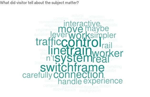
Figure 1: Switchframe – Word Cloud for Learning Outcomes
Findings
Following the completion of these four objectives, the team analyzed all the data it had received. A common trend noticed with all museums studied in the first objective as well as the Postal Museum in the second objective is that maintenance is the most critical aspect of an interactive exhibit. Additionally, some museums use their interactives for different purposes; The Museum of London uses their interactives to support nearby objects, describing them in a more compact or thorough manner than a physical display would allow, while the National Maritime Museum readily uses interactives as standalone exhibits, to explain concepts or tell a story that is difficult to portray using a static object or display.
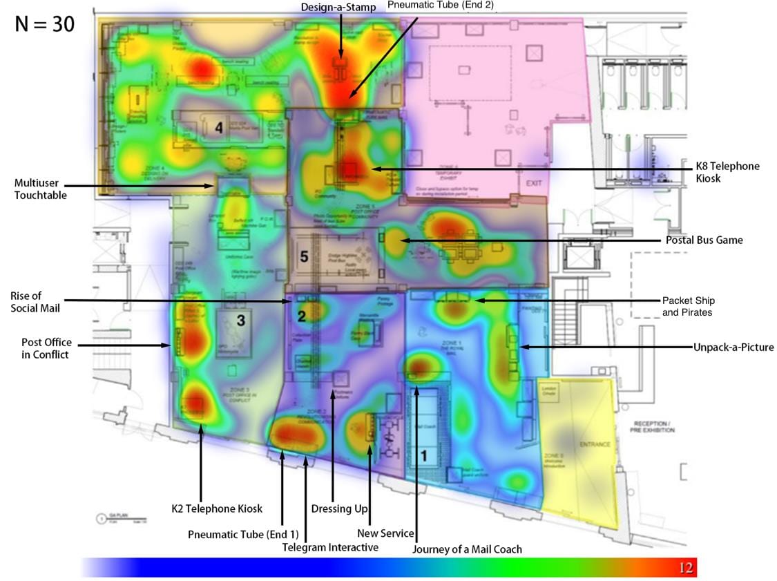
Figure 2: Heat-map of the Postal Museum
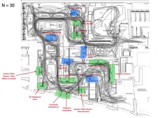
Figure 3: Trace-map of the Postal Museum
The heat map and trace map the team created for the Postal Museum can be found here. Through the visitor study portion of the project, the team discovered that some interactives are not used as frequently as the others, mostly because of their placement; as shown in the figure below, the Timescope interactive in the Mail Rail gallery, for example, is placed in such a manner that visitors often walk around it to see other exhibits, passing it by in the process. Additionally, some interactives are easier to use than others, so visitors will frequently be able to complete all the learning objectives at these interactives, while they may become bored or frustrated with others and pass them by too quickly, missing some of the intended learning objectives.
Recommendations
For deliverables, to help existing interactives to improve, the team composed Report Cards of each interactive exhibit that summarizes all the findings about its advantages and shortcomings, as well as any short and long-term recommendations about improving it. The cards also visualize each exhibit’s performance with a radar chart on four aspects: Attraction, Placement, Engagement, and Recollection. Based on how well each interactive did in these aspects, we gave recommendations that ranged from simple changes that could be done quickly but nonetheless had a large effect, to more long-term changes that would have a similar or greater effect but at a higher cost.
The team also pointed out potential interactive ideas (from similar museums) that the Postal Museum may experiment in its second-year renovation. On top of that, the team gave more general suggestions regarding interactive instructions, live interpreters, and the museum as a whole.